


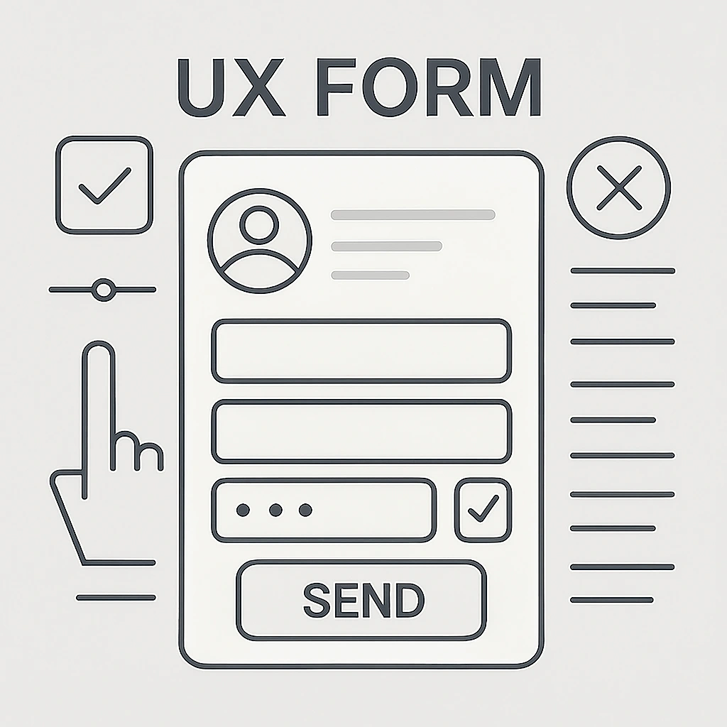
UX of Forms – How to Increase Completion Rates
Forms are often the most important conversion points on a website: the place where a visitor turns into a lead or a customer. Unfortunately, they are also one of the most common points where users abandon the site. Designing forms with the user experience (UX) in mind is not a luxury – it’s a necessity that directly impacts your business. Here’s a practical guide on how to increase your form completion rate.
Why do users abandon forms?
Before we move on to solutions, let’s understand the problem. The main reasons for form abandonment are:
- Too many fields to fill in: The user feels like they’re being interrogated.
- Unclear questions and labels: It’s not clear what data is required.
- Frustrating validation: Error messages are vague or aggressive.
- Lack of trust: Concern about what will happen to their data.
- Technical issues: The form doesn’t work properly on mobile.
Key UX form principles that boost conversion
1. Minimize the number of fields
Every additional field is another barrier. Ask yourself: “Do I really need this data?” Remove all fields that are not absolutely necessary. The shorter the form, the higher the completion rate.
2. Use a clear layout and progression
- Single column: Guides the user naturally downward without distractions.
- Logical order: Ask questions in a natural sequence (e.g., name before address).
- Step-by-step: For longer forms (e.g., checkout), use progression (e.g., “Step 1 of 3”). This reduces psychological resistance.
3. Design clear labels and helpful microcopy
- Labels above fields: Easier to associate with the field than placeholder text (which disappears on click).
- Microcopy: Use short hints below the field to explain what you expect (e.g., “Password must be at least 8 characters, including a number”).
- Clearly mark required fields: Instead of marking optional fields, clearly indicate required ones (e.g., with a red asterisk * and note “* required field”).
4. Choose the right form controls
Make it easier for the user to enter data:
- Dropdown lists (select): For data with a limited number of options (e.g., selecting a state/region).
- Radio buttons: When the user must choose one option from several.
- Checkboxes: For consents and multiple selections.
- Date pickers: For selecting a date from a calendar.
5. Write friendly validation messages
Mistakes happen. What matters is how you respond.
- Real-time validation: Inform about an error immediately after leaving the field, not after clicking “submit.”
- Specific messages: Instead of “Invalid format,” say “VAT number must consist of 10 digits.”
- Success confirmation: When the form is submitted, show a clear message like “Thank you! Your message has been sent.”
6. Build trust
- Privacy policy link: Place it next to the submit button to ease user concerns.
- Lock/SSL icon: Inform users that the connection is encrypted.
- Trust badges: Display logos of well-known payment systems or certifications.
7. Design for mobile devices
- Responsiveness: The form must be easy to complete on any device.
- Proper keyboard: Use the
type=attribute in HTML fields to trigger the right keyboard (e.g.,type="email"for a keyboard with the @ symbol,type="tel"for a numeric keypad).
8. Create an attractive and clear call to action (CTA)
The submit button is the most important element of the form.
- Use action words: Instead of “Submit,” write “Sign up,” “Get the guide,” “Place order.”
- Contrasting color: The button must clearly stand out from the background.
- Proper size: It shouldn’t be too small, especially on mobile.
Summary
Designing UX forms is an investment in higher completion rates and conversions. The key lies in empathy and simplifying the process. Treat the user like a guest – guide them step by step, remove obstacles, and provide a sense of security. Test different solutions, gather feedback, and keep optimizing. Small changes, such as shortening the form or improving an error message, can make a huge difference in results.